CSS Basic Notes
CSS Working Group
- CSS working group: CSS WG.
- W3C standard types:
- ED:
Editor's Draft. - FPWD:
First Public Working Draft. - WD:
Working Draft. - CR:
Candidate Recommendation. - PR:
Proposed Recommendation. - REC: a W3C
Recommendationis a W3C Technical Report.
- ED:

CSS Cascading and Inheritance
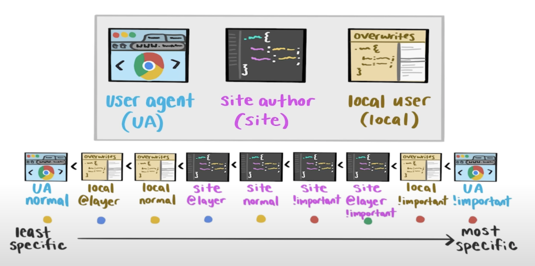
Cascading Order
- Inherit styles.
- User agent normal styles.
- User normal styles.
- Author
@layernormal styles. - Author normal styles.
- Animation styles.
- Author
!importantstyles. - Author
@layer!importantstyles. - User
!importantstyles. - User agent
!importantstyles. - Transition styles.
Transition > Animation > Normal >
@layer> User > User Agent > Inherit
- 级联水平高的 styles 应用 !important 后, 其优先级变低.
- 级联水平低的 styles 应用 !important 后, 其优先级变高.
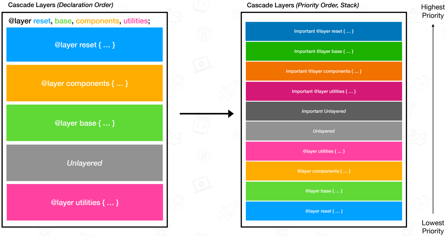
Layer
Layer Formal Syntax
@layer formal syntax:
@layer [<layer-name># | <layer-name>?  {
  <stylesheet>
}];
@layer base;
@layer theme, layout, components, utilities;

@layer base {
  html {
    font-size: 1rem;
  }
}

@layer {
  html {
    font-size: 1rem;
  }
}
@layer reset, externals, base, components, utilities;

@import url('reset.css') layer(reset);
@import url('carousel.css') layer(externals);
@import url('map.css') layer(externals);
<link
  rel="stylesheet"
  href="reset.css"
  layer="reset"
  media="supports(at-rule(@layer))"
/>
Layer Specificity
/* utilities > components > layout > theme */
@layer theme, layout, components, utilities;

/* c > c.d > a > a.b */
@layer a {
  p {
    color: red;
  }

  @layer b {
    p {
      color: green;
    }
  }
}

@layer c {
  p {
    color: orange;
  }

  @layer d {
    p {
      color: blue;
    }
  }
}
Specificity
Specificity
(Selector Priority) has 4 bits,
thousands, hundreds, tens, ones 0000:
- Thousands: inline-style.
- Hundreds: ID selector (实际开发中一般用
[id="Id"]代替优先级过高的 ID selector). - Tens: class selector, attribute selector, pseudo class(
:). - Ones: type selector, pseudo element(
::).
- Universal selector (
*), combinators (+,>,~,a b) and:where()have no effect on specificity. :not()/:is()/:has()have no effect on specificity, but selectors in it have effect on specificity.
<!-- specificity: 1000 -->
<h1 style="color: black">Hello</h1>
/* specificity: 0001 */
h1 {
  color: red;
}

/* specificity: 0100 */
#id {
  color: green;
}

/* specificity: 0003 */
h1 + p::first-letter {
  color: blue;
}

/* specificity: 0022 */
li > a[href*='link-url'] > .inline-warning {
  color: yellow;
}

/* specificity: 0023 */
div li:nth-child(2) a:hover,
div li:nth-child(2) a:focus {
  border: 10px dashed black;
}

/* specificity: 0024 */
div div li:nth-child(2) a:hover,
div div li:nth-child(2) a:focus {
  border: 10px solid black;
}

/* specificity: 0033 */
div div .nav:nth-child(2) a:hover,
div div .nav:nth-child(2) a:focus {
  border: 10px double black;
}

/* specificity: 0101 */
#outer a {
  background-color: red;
}

/* specificity: 0104 */
#outer div ul li a {
  color: yellow;
}

/* specificity: 0113 */
#outer div ul .nav a {
  color: white;
}

/* specificity: 0201 */
#outer #inner a {
  background-color: blue;
}
Styles for a directly targeted element will always take precedence over inherited styles, regardless of the specificity of the inherited rule:
#parent {
  color: green;
}

/* <h1> element will be purple */
h1 {
  color: purple;
}
Increasing specificity by duplicating selector:
.my-class.my-class.my-class span {
  /* 0-3-1 */
  color: white;
}

:is(.my-class.my-class.my-class, span) {
  /* 0-3-0 */
  color: white;
}
Inheritance
- Most CSS properties that affect the text node are inherited properties: color, font-size, font-family, etc.
- Most CSS properties that affect the element node are non-inherited properties.
- When the
unsetvalue is set on an inherited property, it resets the property value to its inherited value. unsetvalue resets a non-inherited property to itsinitialvalue.revertreverses the CSS default values to the browser user-agent styles.
Inheritable CSS Property
- visibility
- cursor
- color
- direction
- font-family
- font-size
- font-style
- font-variant
- font-weight
- font
- line-height
- letter-spacing
- word-spacing
- white-space
- text-align
- text-indent
- text-transform
- border-collapse
- border-spacing
- caption-side
- empty-cells
- list-style-image
- list-style-position
- list-style-type
- list-style
- orphans
- quotes
- widows
CSS Selectors
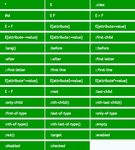
Universal Selector
*:
- 不影响选择器优先级.
- 匹配自定义元素,
<script>,<style>,<title>. - 不匹配伪元素.
Type Selector
p {
  margin-bottom: 1em;
  line-height: 1.5em;
}
Attribute Selector
E[attr]:
/* 定位页面里所有具有必填属性 "required" 的 input */
input[required] {
  border: 1px solid #f00;
}
E[attr=value] match value:
/* 定位页面里的密码输入框 */
input[type='password'] {
  border: 1px solid #aaa;
}
E[attr|=value] match value/value-:
/**
 * 定位页面里所有的 pre 里具有 class 属性且属性值为 language 或是 language- 开头的
 * 比如 class="language", class="language-tsx"
 */
pre[class|='language'] {
  color: #333;
}
E[attr~=value] match value/* value *:
/**
 * 定位页面里所有具有属性 title 且属性值里拥有完整单词 english 的 div 容器
 * 比如 title="english", title="a english"
 */
div[title~='english'] {
  color: #f88;
}
E[attr^=value] match ^value:
/**
 * 定位页面里具有属性 class 且属性值以 a 开头的 div 容器
 * 比如 class="a", class="ab"
 */
div[class^='a'] {
  color: #666;
}
E[attr$=value] match value$:
/**
 * 定位页面里具有属性 class 且属性值以 a 结尾的 div 容器
 * 比如 class="nba", class="cba"
 */
div[class$='a'] {
  color: #f00;
}
E[attr*=value] match *value*:
/* 定位所有 title 里具有 link 字符串的 a 链接 */
a[title*='link'] {
  text-decoration: underline;
}
Descendant Combinator
E F 后代选择器:
ul li {
  margin-bottom: 0.5em;
}
Using the descendant selector without more specificity can be really expensive. The browser is going to check every descendant element for a match because the relationship isn't restricted to parent and child.
For .container ul li a selector:
- match every
<a>on the page - find every
<a>contained in a<li> - use the previous matches and narrow down to
the ones contained in a
<ul> - finally, filter down the above selection to
the ones contained in an element with the class
.container
Child Combinator
E > F 子代选择器:
ul > li {
  list-style: none;
} /* 仅限ul的直接子元素li, 忽略嵌套子元素 */
General Sibling Combinator
E ~ F 一般兄弟选择器:
/* p before h1 */
p {
  color: #fff;
}

/* 定位具有相同父元素的, h1标签之后的所有p标签 */
h1 ~ p {
  color: #f00;
}
Checkbox input as hidden click event listener:
input.checkbox {
  visibility: hidden;
  opacity: 0;
}

nav {
  transform: scale(0);
}

input.checkbox:checked ~ nav {
  transform: scale(1);
}
Adjacent Sibling Combinator
E + F 相邻兄弟选择器:
* + * {
  margin-top: 1.5em;
}
li + li {
  border-top: 1px solid #ddd;
}
Location Pseudo Class
Link Pseudo Class
:link:
- 只匹配未访问的
<a href>. - 可用
a/[href]选择器代替.
Visited Pseudo Class
:visited:
- 只匹配访问过的
<a href>. - 只支持设置颜色:
color/background-color/outline-color/border-color/column-rule-color/text-decoration-color. - 不支持颜色透明度 (
alpha). - 只支持重置已有颜色, 不能新增设置样式.
window.getComputedStyle无法获取到:visited设置颜色.
Any Link Pseudo Class
:any-link:
- 同时匹配
:link与:visited元素. - 匹配所有设置了
[href]的链接元素:<a href>/<link href>/<area href>.
Target Pseudo Class
:target:
- 该选择器定位当前活动页面内定位点的目标元素 (#anchor-name)
#info:target {font-size:24px;}. - 可用于实现 tab/modal/carousel/gallery/slide:
- 利用
display:none隐藏#id元素, 不会触发页面滚动 (防止页面抖动), 可以触发:target伪类匹配. :target ~ .content控制实际内容切换.
- 利用
<a href="#p1">p1</a>
<div id="p1">p1</div>

<style>
  div:target {
    background-color: purple;
  }
</style>
.anchor {
  display: none;
}

.content {
  max-height: 0;
}

.anchor:target ~ .content {
  max-height: 100%;
}
:target-within:
- Selected when any children targeted.
User Action Pseudo Class
Hover Pseudo Class
- 鼠标移动到容器时的状态.
- 不仅限于链接, 可用于页面中的任何元素.
Active Pseudo Class
:active:
- 点击 (mouse click/screen touch) 时的状态.
- 键盘访问无法激活
:active. - 不仅限于链接, 可用于任何具有
tabindex属性的元素.
:link —> :visited —> :hover —> :active links:
/* Unvisited links */
a:link {
  color: blue;
}

/* Visited links */
a:visited {
  color: purple;
}

/* Hovered links */
a:hover {
  background: yellow;
}

/* Active links */
a:active {
  color: red;
}
[href]:active,
button:active,
[type='button']:active,
[type='reset']:active,
[type='submit']:active {
  clip-path: polygon(0 0, 100% 0, 100% 100%, 0 100%);
  background: linear-gradient(rgb(0 0 0 / 5%), rgb(0 0 0 / 5%));
  outline: 999px solid rgb(0 0 0 / 5%);
  outline-offset: -999px;
  box-shadow: inset 0 0 0 999px rgb(0 0 0 / 5%);
}
Focus Pseudo Class
:focus:
- 获得焦点时的状态 (包括键盘访问).
- 不仅限于
<a href>/<button>/<input>/<select>/<area>/<summary>, 可用于任何具有tabindex/contenteditable属性的元素.
:focus-visible:
- Selected when
Tab(keyboard) focused. - 可用于区分鼠标与键盘激活样式.
Separate focus styles:
/* Tab Focus Style */
.button:focus-visible {
  outline: 2px solid #416dea;
  outline-offset: 2px;
  box-shadow: 0 1px 1px #416dea;
}

/* Mouse Focus Style */
.button:focus:not(:focus-visible) {
  outline: none;
}
:focus-within:
- Selected when any children focused.
- 可用于实现
dropdown.
.dropdown-list {
  display: none;
}

.dropdown:focus-within .dropdown-list {
  display: block;
}
Input Pseudo Class
:autofill.:enabled: 匹配启用的界面元素, e.ginput.:disabled: 匹配禁用的界面元素 ([disabled]), e.ginput.:read-only: 匹配其内容无法供用户修改的元素 (<div>/[readonly]).:read-write: 匹配其内容可供用户修改的元素 (<div contenteditable>/<input>).:default: 匹配处于默认状态的表单元素, 可用于默认选项/推荐选项样式.:checked: 匹配处于选中状态的表单元素, 可用于开关选框/多选框样式, e.g tab, dropdown, modal, carousel, tree, checkbox grid.:indeterminate:- 匹配处于未选状态的单选框元素
<input type="radio">. - 匹配处于半选状态的复选框元素
<input type="checkbox">. - 匹配处于未设置
value的进度条元素<progress>.
- 匹配处于未选状态的单选框元素
:valid: 匹配输入验证有效的表单元素 (<input type>/<input pattern>).:invalid: 匹配输入验证无效的表单元素.:user-invalid: 匹配用户交互后仍然验证无效的表单元素.:in-range: 匹配具有范围限制的元素, 其中该值位于限制范围内, e.g 具有min和max属性的number和range输入框.:out-of-range: 与:in-range选择相反, 其中该值位于限制范围外.:required: 匹配具有必填属性[required]的表单元素.:optional: 匹配没有必填属性[required]的表单元素.:placeholder-shown: selectinputwith placeholder, 可用于控制输入样式.
@media only screen and (prefers-reduced-motion: reduce) {
  .msg {
    transition: none;
  }
}

.msg {
  opacity: 0;
  transition: opacity 0.2s ease-in-out;
}

.input:not(:placeholder-shown) ~ .label,
.input:focus ~ .label {
  opacity: 1;
}
Structural Pseudo Class
:root:- 根元素, 始终指 html 元素.
:root选择器优先级高于html选择器.- 为了代码可读性,
:root用于设置全局变量,html用于设置全局样式.
:empty: 没有任何子元素的元素, 不能有注释节点与文本节点.E F:nth-child(n):该选择器定位元素 E 的第 n 个子元素的元素 F,可省略 E.E F:nth-last-child(n): 该选择器定位元素 E 的倒数第 n 个子元素的元素 F,可省略 E.E F:first-child: 第一个孩子.E F:last-child: 最后一个孩子.E F:only-child: 单一后代.E F:nth-of-type(n): 该选择器定位元素 E 的第 n 个 相同类型 子元素,可省略 E.E F:nth-lash-of-type(n): 该选择器定位元素 E 的导数第 n 个 相同类型 子元素,可省略 E.E F:first-of-type: 相同类型 的第一个元素.E F:last-of-type: 相同类型 的最后一个元素.E F:only-of-type: 孩子中只有一种该元素.
n start from 0,
calculation result limit to > 0:
:nth-child(5n):0, 5, 10, 15, ...->5, 10, 15, ....:nth-child(3n + 4):4, 7, 10, 13, ...->4, 7, 10, 13, ....:nth-child(-n + 3):3, 2, 1, 0, -1, ...->3, 2, 1.:nth-child(n + 4):nth-child(-n + 10): 两个n分开计算,4, 5, 6, ...+10, 9, 8, ...->4, 5, 6, 7, 8, 9, 10.
li:first-child:nth-last-child(4),
li:first-child:nth-last-child(4) ~ li {
  /* 当列表正好包含 4 项时, 命中所有列表项 */
  color: darkblue;
}

/* stylelint-disable-next-line no-descending-specificity */
li:first-child:nth-last-child(n + 4),
li:first-child:nth-last-child(n + 4) ~ li {
  /* 当列表至少包含 4 项时, 命中所有列表项 */
  color: darkblue;
}

li:first-child:nth-last-child(n + 2):nth-last-child(-n + 6),
li:first-child:nth-last-child(n + 2):nth-last-child(-n + 6) ~ li {
  /* 当列表包含 2 ~ 6 项时, 命中所有列表项 */
  color: darkblue;
}
Logical Pseudo Class
:not(<selector>):- Selector priority.
- 选择与括号内的选择器不匹配的元素.
:is(<selector>):- Selector priority.
- Legacy name:
:any()/:matches().
:where(<selector>):0priority.
<target>:has(<selector>):- Selector priority.
- A target element has child elements:
:has(> selector). - A target element has sibling elements:
:has(+ selector).
:is(ol, ul) :is(ol, ul) li {
  margin-left: 2rem;
}
Linguistic Pseudo Class
:dir(ltr)/:dir(rtl).:lang(en): 具有使用双字母缩写 (en) 表示的语言的元素.
:lang(en) > q {
  quotes: '\201C' '\201D' '\2018' '\2019';
}

:lang(fr) > q {
  quotes: '<< ' ' >>';
}

:lang(de) > q {
  quotes: '>>' '<<' '\2039' '\203A';
}
Misc Pseudo Class
:fullscreen.
First Letter and Line Pseudo Element
::first-letter/::first-line:
::first-letter: 匹配文本首字母.::first-line: 匹配文本首行.- IE9 及以上版本浏览器支持双冒号, IE8 浏览器只支持单冒号写法.
- 只作用于块级元素:
displayblock/inline-block/list-item/table-cell/table-caption. - 只支持部分 CSS 属性:
color.fontproperties:font-size,font-weight.textproperties:text-decoration,word-spacing.backgroundproperties:background-color,background-image.borderproperties:border-color.float.
Selection Pseudo Element
::selection 匹配突出显示的文本:
color.background-color.cursor.caret-color.outline.text-decoration.text-emphasis-color.text-shadow.stroke-color.fill-color.stroke-width.
/* 定义选中的文本颜色与背景色 */
::selection {
  color: #fff;
  background: #444;
}
Target Text Pseudo Element
::target-text {
  color: white;
  background-color: rebeccapurple;
}
Before and After Pseudo Element
使用 content 属性生成额外的内容并插入在标记中:
a::after {
  content: '↗';
}
attr(), 调用当前元素的属性:
a::after {
  content: '(' attr(href) ')';
}

b::after {
  content: '(' attr(data-language) ')';
}
url()/uri(), 用于引用媒体文件:
h1::before {
  content: url('logo.png');
}
counter(), 调用计数器, 可以不使用列表元素实现序号功能,
配合 CSS3 中counter-increment和counter-reset属性:
<div>
  <h2>HTML</h2>
  <h2>CSS</h2>
  <h2>JS</h2>
</div>

<style>
  div {
    counter-reset: tidbit-counter 58;
  }

  h2::before {
    content: counter(tidbit-counter, list-style-type) ': ';
    counter-increment: tidbit-counter 1;
  }
</style>

<!-- output
  59: HTML
  60: CSS
  61: JS
output -->
伪元素可用于扩大可点击区域:
.btn-text::before {
  position: absolute;
  inset: -6px -8px;
  content: '';
}
Backdrop Pseudo Element
/* Backdrop is only displayed when dialog is opened with dialog.showModal() */
dialog::backdrop {
  background: rgb(255 0 0 / 25%);
}

video::backdrop {
  background-color: #448;
}
Marker Pseudo Element
animation-*.transition-*.color.direction.font-*.content.unicode-bidi.white-space.
li::marker {
  font-variant-numeric: tabular-nums;
  text-align: start;
  text-align-last: start;
  text-indent: 0;
  text-transform: none;
  unicode-bidi: isolate;
}
Shadow DOM Pseudo Class and Element
:host: shadow DOM root element.:host-context: shadow DOM root parent element.::part().::slotted().
Focusable Selector
const FOCUSABLE_SELECTOR = [
  '[contenteditable]',
  '[tabindex="0"]:not([disabled])',
  'a[href]',
  'audio[controls]',
  'button:not([disabled])',
  'iframe',
  'input:not([disabled]):not([type="hidden"])',
  'select:not([disabled])',
  'summary',
  'textarea:not([disabled])',
  'video[controls]',
].join(',');
CSS Data Types
CSS data types define typical values (including keywords and units) accepted by CSS properties and functions:
- Textual data types.
- Numeric data types.
- Quantities.
- Combinations of types.
- Color data types.
- Image data types.
- 2D
<position>.
CSS data types list:
- CSS formal syntax.
- CSS values.
- CSS units.
- CSS functions.
CSS Property Values
Inherit Value
Inherit from parent.
Initial Value
The initial value of a CSS property is its default value, as listed in its standard definition table.
Revert Value
Revert to user agent built in styles.
@supports (-webkit-overflow-scrolling: touch) {
  progress {
    all: revert;
  }
}
Unset Value
Reset to inherit or initial value.
dialog {
  all: unset; /* Exclude `unicode-bidi`, `direction`, custom variables */
}
Specified Value
The specified value of a CSS property is the value it receives from the document's style sheet
Computed Value
The computed value of a CSS property is the value that is transferred from parent to child during inheritance. It is calculated from the specified value by:
- Handling the special values
inherit,initial,unset, andrevert - Doing the computation needed to reach the value described in the "Computed value" line in the property's definition table
span {
  /* display computed to `block` */
  position: absolute;
}
Used Value
The used value of a CSS property is its value after all calculations have been performed on the computed value:
- The used values of dimensions (e.g., width, line-height) are in pixels
- The used values of shorthand properties (e.g., background) are consistent with those of their component properties (e.g., background-color or background-size) and with position and float
Actual Value
The actual value of a CSS property is the used value of that property after any necessary approximations have been applied
The user agent performs four steps to calculate a property's actual (final) value:
- the specified value is determined based on the result of cascading, inheritance, or using the initial value.
- the computed value is calculated according to the specification (for example, a span with position: absolute will have its computed display changed to block)
- layout is calculated, resulting in the used value
- the used value is transformed according to the limitations of the local environment, resulting in the actual value
- initial.
- specified.
- computed.
- used.
- actual value.
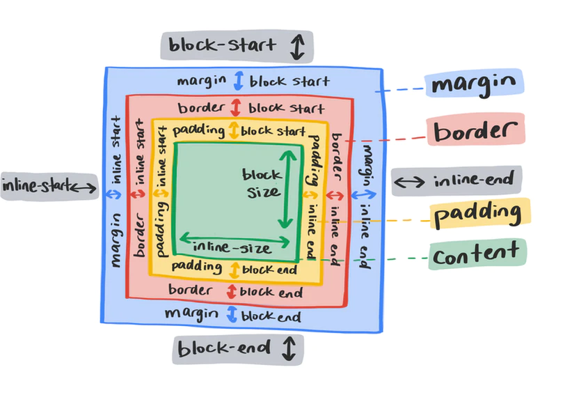
CSS Logical Properties and Values
CSS Logical Basis
In position/size/margin/padding/border/text alignment:
block-startfortop.block-endforbottom.blockfor vertical.inline-startforleft.inline-endforright.inlinefor horizontal.
.logical {
  inline-size: fit-content;
  block-size: fit-content;
  min-inline-size: min-content;
  min-block-size: min-content;
  max-inline-size: max-content;
  max-block-size: max-content;
  padding-block-start: 1rem;
  padding-block-end: 1rem;
  padding-inline-start: 1rem;
  padding-inline-end: 1rem;
  margin-block-start: 1rem;
  margin-block-end: 1rem;
  margin-inline-start: 1rem;
  margin-inline-end: 1rem;
  border-block-start: 1px solid blue;
  border-block-end: 1px solid blue;
  border-inline-start: 1px solid blue;
  border-inline-end: 1px solid blue;
  inset-block-start: 0;
  inset-block-end: 0;
  inset-inline-start: 0;
  inset-inline-end: 0;
}
CSS Logical Reference
CSS Variables
Scope Variables
Inherited Variables
CSS Variables 本质上具有继承特性, HTML 文档树中, 后代元素可以继承祖先元素的 CSS Variables:
<div class="alert alert-info">
  <div class="alert-content">
    <h2 class="alert-title">Info</h2>
    <div class="alert-body">
      <p>Info Message.</p>
    </div>
  </div>
</div>
Contextual Styling Variables
[data-theme='dark'] {
  --fg: hsl(0deg 10% 70%);
  --border: hsl(0deg 10% 10%);
  --bg: hsl(0deg 0% 20%);
  --button-bg: hsl(0deg 0% 25%);
  --input-bg: hsl(0deg 0% 15%);
}

[data-theme='hero'] {
  --fg: hsl(240deg 50% 90%);
  --border: hsl(240deg 50% 10%);
  --bg: hsl(240deg 33% 30%);
  --button-bg: hsl(240deg 33% 40%);
  --input-bg: hsl(240deg 33% 20%);
}
Contextual styling buttons:
:root {
  --primary: hsl(260deg 95% 70%);
  --secondary: hsl(320deg 95% 60%);
}

.button {
  background-color: var(--button-background, transparent);
}

.button-primary {
  --button-background: var(--primary);
}

.button-secondary {
  --button-background: var(--secondary);
}
Contextual styling alerts:
.alert {
  --primary: #777;
  --secondary: #ccc;

  background-color: var(--secondary);
  border: 1px solid var(--primary);
}

.alert::before {
  background-color: var(--primary);
}

.alert-title {
  color: var(--primary);
}

.alert-success {
  --primary: #40c057;
  --secondary: #d3f9d8;
}

.alert-info {
  --primary: #228be6;
  --secondary: #d0ebff;
}

.alert-warning {
  --primary: #fab005;
  --secondary: #fff3bf;
}

.alert-error {
  --primary: #fa5252;
  --secondary: #ffe3e3;
}
Invalid and Empty Variables
--invalid-value: initial;isinvalidvalue leading tovar(--invalid-value)called failed,var(--invalid-value, backup-value)getbackup-value.--empty-value: ;is validemptyvalue leading tovar(--empty-value)called succeeded,var(--empty-value, backup-value)getunsetvalue (inheritorinitialvalue).- Use
invalidandemptyvalue to implementif (true)statement, you can see real world case ontailwind.css.
:root {
  --on: initial;
  --off: ;
}

button {
  --is-raised: var(--off);

  border: 1px solid var(--is-raised, rgb(0 0 0 / 10%));
}

button:hover,
button:focus {
  --is-raised: var(--on);
}
/**
 * css-media-vars
 * BSD 2-Clause License
 * Copyright (c) James0x57, PropJockey, 2020
 */

html {
  --media-print: initial;
  --media-screen: initial;
  --media-speech: initial;
  --media-xs: initial;
  --media-sm: initial;
  --media-md: initial;
  --media-lg: initial;
  --media-xl: initial;

  /* ... */
  --media-pointer-fine: initial;
  --media-pointer-none: initial;
}

/* 把当前变量变为空值 */
@media print {
  html {
    --media-print: ;
  }
}

@media screen {
  html {
    --media-screen: ;
  }
}

@media speech {
  html {
    --media-speech: ;
  }
}

/* 把当前变量变为空值 */
@media (width <= 37.499em) {
  html {
    --media-xs: ;
    --media-lte-sm: ;
    --media-lte-md: ;
    --media-lte-lg: ;
  }
}

/** 移动优先的样式规则 */
.breakpoints-demo > * {
  /** 小于 37.5em, 宽度 100%  */
  --xs-width: var(--media-xs) 100%;

  /** 小于 56.249em, 宽度 49%  */
  --sm-width: var(--media-sm) 49%;
  --md-width: var(--media-md) 32%;
  --lg-width: var(--media-gte-lg) 24%;

  width: var(--xs-width, var(--sm-width, var(--md-width, var(--lg-width))));

  --sm-and-down-bg: var(--media-lte-sm) red;
  --md-and-up-bg: var(--media-gte-md) green;

  background: var(--sm-and-down-bg, var(--md-and-up-bg));
}
Space toggle for progressive enhancement
:root {
  --in-oklab: ;
}

@supports (background: linear-gradient(in oklab, red, tan)) {
  :root {
    --in-oklab: in oklab;
  }
}

/* Usage: */
.card {
  background: linear-gradient(var(--in-oklab) #f00, #0f0);
}
Limit Variables
For some CSS values and units have limits (e.g <color>),
use variables to implement if else statement.
:root {
  --red: 44;
  --green: 135;
  --blue: 255;

  /**
   * 亮度算法:
   * lightness = (red * 0.2126 + green * 0.7152 + blue * 0.0722) / 255
   */
  --lightness: calc(
    (var(--red) * 0.2126 + var(--green) * 0.7152 + var(--blue) * 0.0722) / 255
  );
}

.button {
  /* 文字颜色, 只可能是黑色或白色 */
  color: hsl(0% 0% calc((var(--lightness) - 0.5) * -999999%));

  /* 文字阴影, 黑色文字才会出现 */
  text-shadow: 1px 1px rgb(calc(var(--red) + 50) calc(var(--green) + 50) calc(
          var(--blue) + 50
        ) / calc((var(--lightness) - 0.5) * 9999));

  /* 背景颜色 */
  background: rgb(var(--red) var(--green) var(--blue));

  /* 固定样式 */
  border: 0.2em solid;

  /* 边框样式, 亮度大于 0.8 才出现 */
  border-color: rgb(
    calc(var(--red) - 50) calc(var(--green) - 50) calc(var(--blue) - 50) / calc((
            var(--lightness) - 0.8
          ) * 100)
  );
}
Dark Mode Variables
:root {
  /* Themes */
  --bg-light: #fff;
  --text-light: #000;
  --bg-dark: #000;
  --text-dark: #fff;

  /* Defaults */
  --bg: var(--bg-light);
  --text: var(--text-light);
}

@media (prefers-color-scheme: dark) {
  :root {
    --bg: var(--bg-dark);
    --text: var(--text-dark);
  }
}
Variables API
.element {
  height: 100vh; /* Fallback for browsers that do not support Custom Properties */
  height: calc(var(--vh, 1vh) * 100);
}
window.addEventListener('resize', () => {
  const vh = window.innerHeight * 0.01;
  document.documentElement.style.setProperty('--vh', `${vh}px`);
});
const root = document.documentElement;
const bgColor = getComputedStyle(root).getPropertyValue('--body-bg');
Change --cursor-x and --cursor-y via JavaScript API:
:root::before {
  position: fixed;
  z-index: 1000;
  display: block;
  width: 100%;
  height: 100%;
  pointer-events: none;
  content: '';
  background: radial-gradient(
    circle 16vmax at var(--cursor-x) var(--cursor-y),
    rgb(0 0 0 / 0%) 0%,
    rgb(0 0 0 / 50%) 80%,
    rgb(0 0 0 / 80%) 100%
  );
}
Change --percent via JavaScript API:
.bar {
  display: flex;
  height: 20px;
  background-color: #f5f5f5;
}

.bar::before {
  display: flex;
  justify-content: end;
  width: calc(var(--percent) * 1%);
  font-size: 12px;
  color: #fff;
  white-space: nowrap;
  content: counter(progress) '%\2002';
  counter-reset: progress var(--percent);
  background: #2486ff;
}
Properties and Values API
@property --property-name {
  syntax: '<color>';
  inherits: false;
  initial-value: #c0ffee;
}
window.CSS.registerProperty({
  name: '--my-color',
  syntax: '<color>',
  inherits: false,
  initialValue: '#c0ffee',
});
CSS 不支持背景渐变色的直接过渡动画,
需要使用两层背景渐变 (background + ::before/::after background)
opacity 变化
实现渐变背景的过渡动画.
现在,
可以对 CSS Houdini 自定义变量
设置 transition/animation,
快速实现渐变背景的过渡动画:
@property --houdini-color-a {
  syntax: '<color>';
  inherits: false;
  initial-value: #fff;
}

@property --houdini-color-b {
  syntax: '<color>';
  inherits: false;
  initial-value: fuchsia;
}

.box {
  background: linear-gradient(
    45deg,
    var(--houdini-color-a),
    var(--houdini-color-b)
  );

  /* stylelint-disable-next-line custom-property-no-missing-var-function */
  transition: 1s --houdini-color-a;
  animation: change 10s infinite linear;
}

.box:hover {
  --houdini-color-a: yellowgreen;
}

@keyframes change {
  20% {
    --houdini-color-b: red;
  }

  40% {
    --houdini-color-b: #ff3c41;
  }

  60% {
    --houdini-color-b: orange;
  }

  80% {
    --houdini-color-b: #ae63e4;
  }
}

@property --per {
  syntax: '<percentage>';
  inherits: false;
  initial-value: 25%;
}

.pie {
  background: conic-gradient(
    yellowgreen,
    yellowgreen var(--per),
    transparent var(--per),
    transparent 100%
  );

  /* stylelint-disable-next-line custom-property-no-missing-var-function */
  transition: --per 300ms linear;
}

.pie:hover {
  --per: 60%;
}
@property feature detection and fallback:
@property --parent-em {
  syntax: '<length>';
  initial-value: 0;
  inherits: true;
}

@property --no-at-property-fallback {
  syntax: '*';
  inherits: false;
}

select {
  --parent-em: 1em;
  --no-at-property-fallback: 1em;
}

optgroup {
  /* Will only inherit if `@property` not supported */
  font-size: var(--no-at-property-fallback, 0);
}

optgroup > * {
  font-size: var(--parent-em);
}
CSS Colors
Current Color
currentcolor变量使用当前color计算值.border-color/outline-color/caret-color/text-shadow/box-shadow默认表现为currentcolor.
Accent Color
Change user-interface controls accent color.
HSL Color��
- H: hue.
- S: saturation (stay
50%etc.). - L: lightness (easy to theme colors).
Change hue to get color palette:
- Complement
hue:180deg,brandandsecondarycolor. - Mix
hueto get natural color.
Change lightnessto get color palette:
- Decease
lightnessto get:hover/:focuscolor. - Increase
lightnessto getsecondary/ghostcolor.
/* Hover Button */
:root {
  --primary-h: 221;
  --primary-s: 72%;
  --primary-l: 62%;
}

.button {
  background-color: hsl(var(--primary-h) var(--primary-s) var(--primary-l));
}

.button:hover,
.button:focus {
  --primary-l: 54%;
}

.button-secondary {
  --primary-l: 90%;

  color: #222;
}

.button-ghost {
  --primary-l: 90%;

  background-color: transparent;
  border: 3px solid hsl(var(--primary-h) var(--primary-s) var(--primary-l));
}
Change lightness to get gradient color:
.section {
  background: linear-gradient(
    to left,
    hsl(var(--primary-h) var(--primary-s) var(--primary-l)),
    hsl(var(--primary-h) var(--primary-s) 95%)
  );
}

.section-2 {
  --primary-h: 167;
}
HWB Color
H: hue (<angle>).W: whiteness (<percentage>).B: blackness (<percentage>).A: alpha (<percentage>).
Color Scheme
:root {
  color-scheme: normal;
  color-scheme: light dark;
  color-scheme: light;
  color-scheme: dark;
}
CSS Color Reference
- CSS color module level 5 guide:
- hwb.
- lab.
- lch.
- color-mix.
- color-contrast.
- color.
- accent-color.
- CSS
colorvalue.
CSS Math
Calculation Function
- 支持多种数据类型:
<length>/<frequency>/<angle>/<time>/<percentage>/<number>/<integer>. - 支持加减乘除 4 种运算.
- 运算符前后带单位或者带百分号的值只能进行加减运算, 不能进行乘除运算.
- 加号和减号两侧一定要有空格, 乘号和除号两侧无须空格.
- 结合
CSS Variables, 拥有强大功能与可维护性.
html {
  font-size: calc(16px + 2 * (100vw - 375px) / 39);
}

.button {
  width: calc(100% - 20px);
}

.list {
  --size: calc(100% - 2rem);

  width: calc(var(--size) / 6);
}
If calc() result breaks,
check cache plugin or build tool.
Some tools like to remove whitespace always
lead to broken calc() addition and subtraction operator.
Min and Max Function
.box {
  width: min(100vw - 3rem, 80ch);
  width: max(10px * 10, 10em);
  width: min(calc(10px * 10), 10em);
  width: max(10px * 10, var(--width));
  margin-block-start: min(4rem, 8vh);
}
.legacy-container {
  width: 100%;
  max-width: 1024px;
}

.modern-container {
  width: min(100%, 1024px);
}
.legacy-container {
  width: 100%;
  min-width: 768px;
}

.modern-container {
  width: max(100%, 768px);
}
Clamp Function
.clamp {
  width: max(75px, min(25vw, 125px));
  width: clamp(30ch, 80%, 80ch);
  padding: clamp(1rem, 3%, 1.5rem);
  margin-bottom: clamp(4px, 6.5vh, 5.5rem);
  font-size: clamp(2.25rem, 2vw + 1.5rem, 3.25rem);
  text-indent: clamp(15px, 10%, 1.5rem);
  letter-spacing: clamp(0.1rem, 1.5vw, 0.5rem);
}
Generate fluid size for Tailwind.css:
const settings = {
  typography: {
    fontSizeMin: 1.125,
    fontSizeMax: 1.25,
    msFactorMin: 1.125,
    msFactorMax: 1.2,
    lineHeight: 1.6,
  },
  screensRem: {
    min: 20,
    sm: 40,
    md: 48,
    lg: 64,
    xl: 80,
    '2xl': 96,
  },
  grid: {
    cols: 24,
  },
};

const remToPx = rem => `${rem * 16}px`;

const screens = {
  sm: remToPx(settings.screensRem.sm),
  md: remToPx(settings.screensRem.md),
  lg: remToPx(settings.screensRem.lg),
  xl: remToPx(settings.screensRem.xl),
  '2xl': remToPx(settings.screensRem['2xl']),
};

const fsMin = settings.typography.fontSizeMin;
const fsMax = settings.typography.fontSizeMax;
const msFactorMin = settings.typography.msFactorMin;
const msFactorMax = settings.typography.msFactorMax;
const screenMin = settings.screensRem.min;
const screenMax = settings.screensRem['2xl'];

const calcMulti = (multiMin = 0, multiMax = null) => {
  return {
    fsMin: fsMin * msFactorMin ** multiMin,
    fsMax: fsMax * msFactorMax ** (multiMax || multiMin),
  };
};

const clamp = (multiMin = 0, multiMax = null) => {
  const _calcMulti = calcMulti(multiMin, multiMax || multiMin);
  const _fsMin = _calcMulti.fsMin;
  const _fsMax = _calcMulti.fsMax;
  return `clamp(${_fsMin}rem, calc(${_fsMin}rem + (${_fsMax} - ${_fsMin}) * ((100vw - ${screenMin}rem) / (${screenMax} - ${screenMin}))), ${_fsMax}rem)`;
};

const fontSize = {
  xs: clamp(-2),
  sm: clamp(-1),
  base: clamp(0),
  lg: clamp(1),
  xl: clamp(2),
  '2xl': clamp(3),
  '3xl': clamp(4),
  '4xl': clamp(5),
  '5xl': clamp(6),
  '6xl': clamp(7),
  '7xl': clamp(8),
  '8xl': clamp(9),
  '9xl': clamp(10),
};

module.exports = {
  theme: {
    screens,
    fontSize,
  },
};
CSS Text
Text Alignment
- 对 block level element 无效.
start/end/left/right/center/match-parent.justify: 自适应, 左右都无空格.
.wrap {
  text-align: justify;
  text-align-last: justify; /* 一个块或行的最后一行对齐方式 */
  text-justify: distribute-all-lines; /* ie6-8 */
}
最后一行文字对齐方式.
- type of justification for
text-align: justify. none: turn offtext-align: justify.auto.inter-word.inter-character.
Text Indent
- 作用于 block container, 但实际作用于第一行内联盒子内容.
- 对
display: inline替换元素无效. - 对
display: inline-*替换元素有效. - Percentage
text-indentcalculate bycontaining blockwidth.
.hidden-text {
  font: 0/0;
  color: transparent;
  text-indent: -9999px;
}
pre {
  font-size: 100%;
  tab-size: 2;
  white-space: pre-wrap;
}
Text Spacing
在设计领域, 文本行之间的距离称为行距 (leading),
来源于印刷版每行文字之间添加的一条条的引导线 (lead).
字符之间的距离称之为字距 (tracking).
tailwind.css
使用 leading-{size} 控制 line-height,
使用 tracking-{size} 控制 letter-spacing.
letter-spacing:
- 继承性.
- 默认值为
normal. - 支持负值, 小数值.
word-spacing:
- 继承性.
- 默认值为
normal. - 支持负值, 小数值, 百分比.
- 最终间隔距离会受
text-align: justify影响.
.paragraph {
  line-height: 1.5em; /* 行间距  */
  text-indent: 2em; /* 段落缩进 */
  letter-spacing: 50px; /* 字间距  */
  word-spacing: 50px; /* 词间距  */
}
Text Transform
p {
  font-variant: small-caps; /* 小型的大写字母 */
  text-transform: uppercase; /* 大写字母 */
  text-transform: lowercase; /* 小写字母 */
  text-transform: capitalize; /* 首字母大写 */
}
Text Decoration
.formal-syntax {
  text-decoration: < 'text-decoration-line' > || < 'text-decoration-style' > ||
    < 'text-decoration-color' > || < 'text-decoration-thickness' >;
}
.line {
  text-decoration-line: overline; /* 上划线 */
  text-decoration-line: line-through; /* 中划线 */
  text-decoration-line: underline; /* 下划线 */
}

.text {
  text-decoration: underline;
  text-decoration: dotted underline;
  text-decoration: red underline dashed;
  text-decoration: wavy underline 3px red;
}

.wavy {
  display: block;
  height: 0.5rem;
  padding-top: 0.5rem;
  overflow: hidden;
  letter-spacing: 100vw;
  white-space: nowrap;
}

.wavy::before {
  text-decoration: overline; /* IE */
  text-decoration-style: wavy;
  content: '\2000\2000';
}
下划线样式:
Text Emphasis
<'text-emphasis-style'> || <'text-emphasis-color'>.text-emphasis-style:none.<character>.[ filled | open ] || [ dot | circle | double-circle | triangle | sesame ].
text-emphasis-color:currentcolor | <color>.- 重点符号字号默认为文字字号的一半.
.text {
  /* Initial value */
  text-emphasis: none;

  /* <string> value */
  text-emphasis: 'x';
  text-emphasis: '点';
  text-emphasis: '\25B2';
  text-emphasis: '*' #555;

  /* Keywords value */
  text-emphasis: filled; /* filled dot */
  text-emphasis: open; /* open dot */
  text-emphasis: sesame; /* filled sesame */
  text-emphasis: open sesame;

  /* Keywords value combined with a color */
  text-emphasis: filled sesame #555;
}
[ over | under ] && [ right | left ].over: draws marks over text in horizontal writing mode.under: draws marks under text in horizontal writing mode.right: draws marks to right of text in vertical writing mode.left: draws marks to left of text in vertical writing mode.- 默认在顶部或右侧画重点符号.
.text {
  /* Initial value */
  text-emphasis-position: over right;

  /* Keywords value */
  text-emphasis-position: over left;
  text-emphasis-position: under right;
  text-emphasis-position: left under;
  text-emphasis-position: right over;
}
Text Size Adjust
禁止 iOS 横屏字号自动调整:
body {
  /* stylelint-disable-next-line property-no-vendor-prefix */
  -webkit-text-size-adjust: none;
}
Text Overflow
clip: 切除溢出部分.ellipsis: 省略号标志 (要设置width).
.truncation-article-container {
  width: 500px;
  overflow: hidden;
  text-overflow: ellipsis;
  white-space: nowrap;
}
.article-container {
  display: box;
  overflow: hidden;
  text-overflow: ellipsis;
  word-break: break-all;
  -webkit-box-orient: vertical;
  -webkit-line-clamp: 4; /* 需要显示的行数 */
}
White Space
Web default:
- 空格被解析为换行.
- 换行被解析为空格.
- 自动合并空格.
普通标签内自动忽略空格符,
并将其与空白符转换成一个空格进行输出,
可用 white-space 改变这一行为:
| White Space | 换行符 | 空格和制表符 | 文字换行 | 行尾空格 |
|---|---|---|---|---|
| normal | 合并 | 合并 | 换行 | 删除 |
| nowrap | 合并 | 合并 | 不换行 | 删除 |
| pre | 保留 | 保留 | 不换行 | 保留 |
| pre-wrap | 保留 | 保留 | 换行 | 挂起 |
| pre-line | 保留 | 合并 | 换行 | 删除 |
| break-spaces | 保留 | 保留 | 换行 | 换行 |
dd + dt::before {
  white-space: pre;
  content: '\A';
}

dd + dd::before {
  margin-left: -0.25em;
  font-weight: normal;
  content: ', ';
}
Text Wrap
Text wrapping and word breaking:
word-break:normal: default line break rule.keep-all: Word breaks should not be used for CJK text. Non-CJK text behavior is same as fornormal.break-all: word breaks should be inserted between any two characters (excluding CJK text).
overflow-wrap(word-wrap):normal.anywhere.break-word.
line-break(break lines of CJK text when working with punctuation and symbols):auto.loose.normal.strict.anywhere.
hyphens(how words should be hyphenated when text wraps across multiple lines):manual: words are broken for line-wrapping only where-or­.auto: automatically break words at appropriate hyphenation points.none: words are not broken at line breaks.
<wbr>: word break opportunity.
/* 不换行 */
.nowrap {
  white-space: nowrap;
}

/* 自动换行 */
.auto-wrap {
  hyphens: auto;
  word-break: normal;
  word-wrap: break-word;
  line-break: anywhere;
}

/* 自动换行 */
pre {
  hyphens: auto;
  word-wrap: break-word; /* IE 5.5-7 */
  white-space: pre-wrap; /* Modern Browsers */
  line-break: anywhere;
}

/* 强制换行 */
.force-wrap {
  word-break: break-all;
  line-break: anywhere;
}

/* IE not support <wbr> */
wbr::after {
  content: '\00200B';
}
- 避头标点: 不在行首显示的标点, e.g 逗号, 顿号, 句号, 问号, 叹号.
- 避尾标点: 不在行尾显示的标点, e.g 前引号, 前括号.
.text-truncate-box {
  display: inline-block;
  max-width: 250px;
  overflow: hidden;
  text-overflow: ellipsis;
  word-wrap: normal;
  white-space: nowrap;
}
Text Horizontal Direction
Direction
Set direction of text, table columns, and horizontal overflow:
.ltr {
  direction: ltr;
}

.rtl {
  direction: rtl;
}
Unicode Bidi
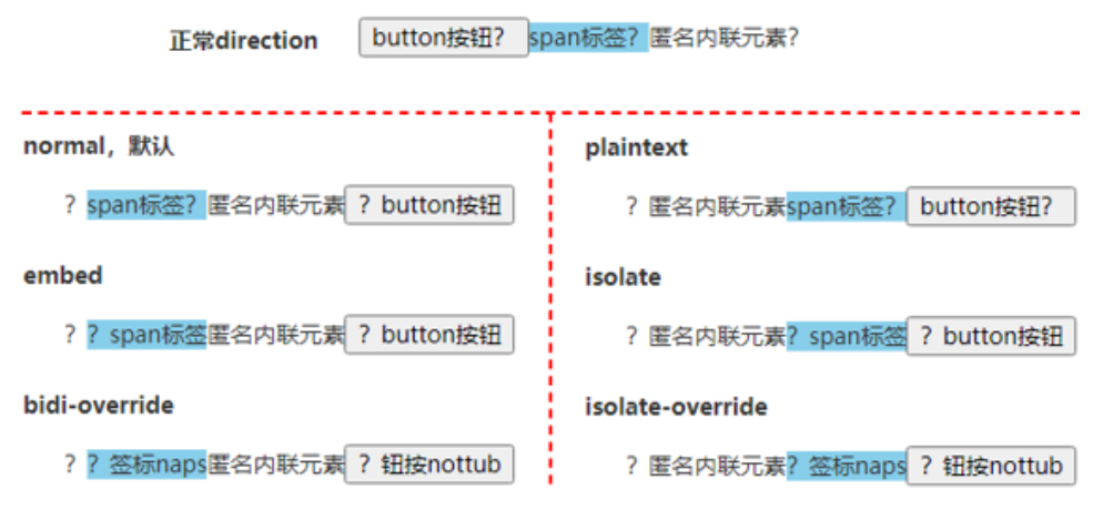
normal.plaintext: 元素内文字 LTR.embed: 中英文字符 LTR, 标点符号 RLT.isolate: 中英文字符 LTR, 标点符号 RLT.bidi-override: 所有字符 RTL.isolate-override: 所有字符 RTL.
<p><button>button按钮?</button><span>span标签?</span>匿名内联元素?</p>

<style>
  p {
    direction: rtl;
  }

  span {
    background-color: skyblue;
  }
</style>
Text Vertical Direction
Writing Mode
Set whether lines of text are laid out horizontally or vertically:
/* 单列展示 */
.wrap-single {
  width: 25px;
  height: auto;
  padding: 8px 5px;
  font-size: 12px;
  hyphens: auto;
  line-height: 18px;
  word-wrap: break-word; /* 英文自动换行 */
}

/* 多列展示 */
.wrap-multiple {
  height: 200px;
  line-height: 30px;
  text-align: justify;
  writing-mode: horizontal-tb; /* 水平排列 */
  writing-mode: vertical-lr; /* 竖直从左向右 */
  writing-mode: vertical-rl; /* 竖直从右向左 */
  writing-mode: lr-tb; /* IE: 水平排列 */
  writing-mode: tb-lr; /* IE: 竖直从左向右 */
  writing-mode: tb-rl; /* IE: 竖直从右向左 */
}
Text Orientation
mixed: 中文字符正立, 英文字符旋转 90 度.upright: 中文字符正立, 英文字符正立.sideways/sideways-right: 中文字符旋转 90 度, 英文字符旋转 90 度.
Text Combine Upright
none.all: 横向合并所有类型字符.digits <integer>?: 横向合并数字字符.
CSS Font
Font Family
Generic Font Family
serif: 衬线字体族.sans-serif: 无衬线字体族.monospace: 等宽字体族.cursive: 手写字体族.fantasy: 奇幻字体族.emoji: 表情字体族.math: 数学表达式字体族.fangsong: 仿宋字体族.system-ui: 系统 UI 字体族.ui-serif: 系统衬线字体.ui-sans-serif: 系统无衬线字体.ui-monospace: 系统等宽字体.ui-rounded: 系统圆形字体.
English Font Family
Segoe UI: Windows 从 Vista 版本开始默认的西文字体族.Roboto: Android 中的一款无衬线字体.Helvetica: macOS 和 iOS 中很常用的一款无衬线字体.Arial: 全平台都支持的一款无衬线字体.
body {
  font-family:
    system-ui,
    -apple-system,
    'Segoe UI',
    Roboto,
    Helvetica,
    Arial,
    sans-serif;
}
Emoji Font Family
Apple Color Emoji: macOS and iOS.Segoe UI Emoji: Windows.Segoe UI Symbol: Windows 7 新增字体, 是一种 Unicode 编码字体, 显示的是单色图案, 非彩色图形.Noto Color Emoji: 谷歌出品的 emoji 字体, 用于 Android 和 Linux.
@font-face {
  font-family: Emoji;
  src: local('Apple Color Emoji'), local('Segoe UI Emoji'), local(
      'Segoe UI Symbol'
    ), local('Noto Color Emoji');
  font-display: swap;
  unicode-range: U+1F000-1F644, U+203C-3299;
}

body {
  font-family:
    system-ui,
    -apple-system,
    'Segoe UI',
    Roboto,
    Emoji,
    Helvetica,
    Arial,
    sans-serif;
}
Math Font Family
Cambria Math: Windows 中的数学字体.Latin Modern Math: macOS 中的数学字体.
math {
  font-family: 'Cambria Math', 'Latin Modern Math', serif;
}
Chinese Font Family
宋体 SimSun
黑体 SimHei
微软雅黑 Microsoft YaHei
微软正黑体 Microsoft JhengHei
新宋体 NSimSun
新细明体 PMingLiU
细明体 MingLiU
标楷体 DFKai-SB
仿宋 FangSong
楷体 KaiTi
仿宋_GB2312 FangSong_GB2312
楷体_GB2312 KaiTi_GB2312

宋体: SimSun
华文细黑: STHeiti Light [STXihei]
华文黑体: STHeiti
华文楷体: STKaiti
华文宋体: STSong
华文仿宋: STFangsong
儷黑 Pro: LiHei Pro Medium
儷宋 Pro: LiSong Pro Light
標楷體: BiauKai
蘋果儷中黑: Apple LiGothic Medium
蘋果儷細宋: Apple LiSung Light

新細明體: PMingLiU
細明體: MingLiU
標楷體: DFKai-SB
黑体: SimHei
新宋体: NSimSun
仿宋: FangSong
楷体: KaiTi
仿宋_GB2312: FangSong_GB2312
楷体_GB2312: KaiTi_GB2312
微軟正黑體: Microsoft JhengHei
微软雅黑体: Microsoft YaHei

隶书: LiSu
幼圆: YouYuan
华文细黑: STXihei
华文楷体: STKaiti
华文宋体: STSong
华文中宋: STZhongsong
华文仿宋: STFangsong
方正舒体: FZShuTi
方正姚体: FZYaoti
华文彩云: STCaiyun
华文琥珀: STHupo
华文隶书: STLiti
华文行楷: STXingkai
华文新魏: STXinwei
Font Family Preset
.mi {
  font-family: Arial, 'Microsoft YaHei', '黑体', '宋体', sans-serif;
}

.tao-ux {
  font-family: Helvetica, 'Hiragino Sans GB', 'Microsoft Yahei', '微软雅黑',
    Arial, sans-serif;
}

.tao {
  font:
    12px/1.5 Tahoma,
    Helvetica,
    Arial,
    '宋体',
    sans-serif;
}

.tao-ued {
  font:
    12px/1 Tahoma,
    Helvetica,
    Arial,
    '\5b8b\4f53',
    sans-serif;
}

.one-plus {
  font:
    14px/1.5 'Microsoft YaHei',
    Arial,
    Tahoma,
    '\5b8b\4f53',
    sans-serif;
}

.github {
  font-family: -apple-system, BlinkMacSystemFont, 'Segoe UI', Helvetica, Arial,
    sans-serif, 'Apple Color Emoji', 'Segoe UI Emoji';
}

.font-sans-serif {
  font-family:
    -apple-system,
    BlinkMacSystemFont,
    'Avenir Next,' Avenir,
    'Segoe UI',
    'Helvetica Neue',
    Helvetica,
    Cantarell,
    Ubuntu,
    Roboto,
    Noto,
    Arial,
    sans-serif;
}

.font-serif {
  font-family: Georgia, Cambria, 'Iowan Old Style', 'Apple Garamond',
    Baskerville, 'Times New Roman', 'Droid Serif', Times, 'Source Serif Pro',
    serif, 'Apple Color Emoji', 'Segoe UI Emoji', 'Segoe UI Symbol';
}

.font-mono {
  font-family: Menlo, Consolas, Monaco, 'Liberation Mono', 'Lucida Console',
    'Courier New', monospace;
}
Font Size
ch: calculate by0width.ex: calculate byxwidth.em:- Calculate by original
font-size(inheritsize or current size). - 当用
em指定多重嵌套的元素的字号时, 会产生不断放大/缩小的结果, 故一般避免在font-size上使用em. - 在
margin/padding/border上使用em时, 可使得布局随font-size大小改变而改变.
- Calculate by original
rem: calculate by rootfont-size.<percentage>: calculate by parentfont-size.
html {
  /* 浏览器默认size为16px, 此时将html-size自动计算为10px */
  font-size: 62.5%;
}

small {
  /* 11px */
  font-size: 1.1rem;
}

strong {
  /* 18px */
  font-size: 1.8rem;
}
Font Size Adjust
- 使字体保持大小, 不随字体类型改变而改变.
- 不同字体有不同的值 (
x-height/字体尺寸).
Font Stretch
font-stretch,
selects a normal, condensed, or expanded face from a font:
normal.ultra-condensed | extra-condensed | condensed | semi-condensed.semi-expanded | expanded | extra-expanded | ultra-expanded.<percentage>.
| Keyword | Percentage |
|---|---|
| ultra-condensed | 50% |
| extra-condensed | 62.5% |
| condensed | 75% |
| semi-condensed | 87.5% |
| normal | 100% |
| semi-expanded | 112.5% |
| expanded | 125% |
| extra-expanded | 150% |
| ultra-expanded | 200% |
Font Kerning
font-kerning,
字距调整:
auto.normal: enable kerning.none: disable kerning.
Font Style
normal.italic.oblique.oblique <angle>.
Font Synthesis
- Controls which missing typefaces, bold, italic, or small-caps may be synthesized by the browser.
- Initial value:
weight style. - Formal syntax:
none | [ weight || style || small-caps ].
<em class="syn">Synthesize me! 站直。</em>
<br />
<em class="no-syn">Don't synthesize me! 站直。</em>

<style>
  em {
    font-weight: bold;
  }

  .syn {
    font-synthesis: style weight small-caps;
  }

  .no-syn {
    font-synthesis: none;
  }
</style>

Font Variant
normal.none.font-variant-caps:small-caps: 小体型大写字母.all-small-caps.petite-caps: 特小型大写字母.all-petite-caps.unicase: 混合模式, 可以有小体型大写字母, 大写字母, 大体型小写字母.titling-caps: 标题大写字母.
font-variant-east-asian:ruby: 日文上标假名.jis78/jis83/jis90/jis04: 使用对应年份的日语字符集.simplified: 简体字形.traditional: 繁体字形.proportional-width: 不等宽字形.full-width: 等宽字形.
font-variant-ligatures:common-ligatures: 使用连字效果.discretionary-ligatures: 使用特殊连字效果, 设计师设计具体效果表现.historical-ligatures: 使用古代连字效果.contextual-ligatures: 使用上下文连字效果, 前后字母影响具体效果表现.
font-variant-numeric:ordinal: 强制使用序数标记特殊的标志符号, e.g1st,2nd,3rd,4th.slashed-zero: 强制使用带斜线的0.lining-nums: 沿基线对齐.oldstyle-nums: 传统对齐方式.proportional-nums: 不等宽数字.tabular-nums: 等宽数字.diagonal-fractions: 斜线分隔分子母stacked-fractions: 水平线分隔分子母.
Font Display
The font display timeline:
- block period: font face is not loaded, render an invisible fallback font face (use normally when loaded in this period)
- swap period: font face is not loaded, render a fallback font face (use normally when loaded in this period)
- failure period: the user agent treats it as a failed load causing normal font fallback
font-display
decides how a font face is displayed based on
whether and when it is downloaded and ready to use:
auto: font display strategy defined by the user agent.block: a short block period and an infinite swap period.swap: an extremely small block period and an infinite swap period.fallback: an extremely small block period and a short swap period.optional: an extremely small block period and no swap period.
@font-face {
  font-family: ExampleFont;
  font-style: normal;
  font-weight: 400;
  src:
    url('/path/to/fonts/exampleFont.woff') format('woff'),
    url('/path/to/fonts/exampleFont.eot') format('eot');
  font-display: fallback;
}
Custom Font Face
@font-face 使用户使用自定义字体:
@font-face {
  font-family: mySpecialFont;
  font-style: inherit;
  font-weight: inherit;
  font-variant: inherit;
  src: url('./Colleen.ttf');
  font-display: swap;
}

.selector {
  font-family: mySpecialFont, sans-serif;
}
Custom Font Format
@font-face {
  font-family: 'Open Sans Regular';
  font-style: normal;
  font-weight: 400;
  src:
    local('Open Sans Regular'),
    local('OpenSans-Regular'),
    url('open-sans/OpenSans-Regular-Cyrillic.woff2') format('woff2'),
    url('open-sans/OpenSans-Regular-Cyrillic.woff') format('woff'),
    url('open-sans/OpenSans-Regular-Cyrillic.eot') format('embedded-opentype'),
    url('open-sans/OpenSans-Regular-Cyrillic.ttf') format('truetype');
  font-display: swap;
  unicode-range: U+0400-045F, U+0490-0491, U+04B0-04B1;
}
Custom Font Style and Weight
@font-face {
  font-family: myFont;
  font-weight: 400;
  src: local('Font 40S');
}

@font-face {
  font-family: myFont;
  font-weight: 500;
  src: local('Font 50S');
}

@font-face {
  font-family: myFont;
  font-weight: 600;
  src: local('Font 60S');
}

@font-face {
  font-family: myFont;
  font-style: italic;
  src: local('Font Italic');
}

.text-normal,
.text-medium,
.text-semibold,
.text-italic {
  font-family: myFont, sans-serif;
}

.text-normal {
  font-weight: 400;
}

.text-medium {
  font-weight: 500;
}

.text-semibold {
  font-weight: 600;
}

.text-italic {
  font-style: italic;
}
Font Performance
- Compress fonts: better formats (e.g
woff2/woff). - Subset fonts:
unicode-range. - Local fonts:
local().
@font-face {
  /* Single value */
  unicode-range: U+0026;
}

@font-face {
  /* Range */
  unicode-range: U+0000-007F;
}

@font-face {
  /* Wildcard Range */
  unicode-range: U+002?;
}

@font-face {
  /* Multiple Values */
  unicode-range: U+0000-007F, U+0100, U+02??;
}
CSS Content
content replaces an element with a generated value:
- Objects inserted are
Anonymous Replaced Elements. - CSS-generated content is not included in the DOM,
will not be represented in
accessibility tree.
CSS Counter
Adjust the appearance of content based on its location in a document.
/* Set a counter named 'section', and its initial value is 0. */
body {
  counter-reset: section;
}

/* Increment the value of section counter by 1 */

/* Display the value of section counter */
h3::before {
  content: counter(section);
  counter-increment: section;
}
Nested counters counters(counterName, hyphenString):
ol {
  list-style-type: none;
  counter-reset: section; /* 为每个ol元素创建新的计数器实例 */
}

li::before {
  content: counters(section, '.') ' '; /* 为所有计数器实例增加以`.`分隔的值 */
  counter-increment: section; /* 只增加计数器的当前实例 */
}
<ol>
  <li>item</li>
  <!-- 1     -->
  <li>
    item
    <!-- 2     -->
    <ol>
      <li>item</li>
      <!-- 2.1   -->
      <li>item</li>
      <!-- 2.2   -->
      <li>
        item
        <!-- 2.3   -->
        <ol>
          <li>item</li>
          <!-- 2.3.1 -->
          <li>item</li>
          <!-- 2.3.2 -->
        </ol>
        <ol>
          <li>item</li>
          <!-- 2.3.1 -->
          <li>item</li>
          <!-- 2.3.2 -->
          <li>item</li>
          <!-- 2.3.3 -->
        </ol>
      </li>
      <li>item</li>
      <!-- 2.4   -->
    </ol>
  </li>
  <li>item</li>
  <!-- 3     -->
  <li>item</li>
  <!-- 4     -->
</ol>
<ol>
  <li>item</li>
  <!-- 1     -->
  <li>item</li>
  <!-- 2     -->
</ol>
CSS Interaction
Cursor
auto/default/pointer/move/text.wait/help/crosshair/progress.not-allowed/no-drop/vertical-text/all-scroll.none/alias/cell/copy/context-menu.grab/grabbing.n-resize/e-resize/s-resize/w-resize.ne-resize/nw-resize/se-resize/sw-resize.col-resize/row-resize.ew-resize/ns-resize/nesw-resize/nwse-resize.zoom-in/zoom-out.url().
.wrap {
  pointer-events: none;
  cursor: default;
}
Pointer Events
auto.none:- 不能阻止键盘行为: 元素依然可以通过
Tab键被focus. - 无法显示
[title]等A11Y提示, 影响无障碍访问 (特别是移动端). - 综上所述,
none不适合<a>/<button>等控件元素, 适合作用在装饰性的或仅用作视觉表现的非控件元素.
- 不能阻止键盘行为: 元素依然可以通过
- 具有继承性.
Touch Action
auto: enable all panning and zooming gestures.none: disable all panning and zooming gestures.manipulation: only enable panning and pinch zoom gestures (滚动, 持续缩放), remove click delay (300ms) for mobile device.[pan-x | pan-left | pan-right ] || [ pan-y | pan-up | pan-down ] || pinch-zoom.
.box {
  touch-action: auto;
  touch-action: none;
  touch-action: manipulation;
  touch-action: pan-x;
  touch-action: pan-left;
  touch-action: pan-right;
  touch-action: pan-y;
  touch-action: pan-up;
  touch-action: pan-down;
  touch-action: pinch-zoom;
  touch-action: pan-left pan-up pan-zoom;
}
Resize
none.both.horizontal.vertical.inline.block.- 不支持内联元素.
- 支持
overflownon-visible块级元素. - 可用
min-width/min-height/max-width/max-height限制拉伸范围.
.editable {
  overflow: hidden;
  resize: both;
}
<div class="image-slider">
  <div class="image-before">
    <img src="cat-before.jpg" alt="Before" />
  </div>
  <img class="image-after" src="cat-after.jpg" alt="After" />
  <input type="range" class="image-a11y-control" />
</div>

<style>
  .image-slider {
    position: relative;
    display: inline-block;
  }

  .image-slider img {
    display: block;
    user-select: none;
  }

  .image-slider > div {
    position: absolute;
    top: 0;
    bottom: 0;
    left: 0;
    width: 50%; /* resizable width */
    max-width: 100%;
    overflow: hidden;
    resize: horizontal;
  }

  .image-slider > div::before {
    position: absolute;
    right: 0;
    bottom: 0;
    width: 12px;
    height: 12px;
    padding: 5px;
    cursor: ew-resize;
    content: '';
    background: linear-gradient(-45deg, white 50%, transparent 0);
    background-clip: content-box;
  }
</style>

<script>
  /* Additional range input feature */
  const range = document.querySelector('.image-a11y-control');
  range.addEventListener('input', event => {
    document.querySelector(
      '.image-before'
    ).style.width = `${event.target.value}%`;
  });
</script>
User Select
禁止图文被选中, 保持和原生 App 一样的文字选中体验:
.body {
  -webkit-touch-callout: none;
  user-select: none;
}
点击任意位置实现全选效果:
.box {
  user-select: all;
}
Caret Color
输入框光标颜色:
input {
  caret-color: red;
}
CSS Scrolling
Scroll Behavior
auto.smooth.
html,
body {
  scroll-behavior: smooth;
}
Overscroll Behavior
auto{1,2}.contain{1,2}: 嵌套滚动不会传导至相邻区域, 即嵌套滚动条滚动到底部便停止, 不会继续滚动外部滚动条.none{1,2}.
Scroll Snap
- 可让网页容器滚动停止时, 自动平滑定位到指定元素的指定位置.
- Parent (scroll port) property:
scroll-snap-type.scroll-padding.overscroll-behavior.- Overflow axis.
- Children (scroll item) property:
<div class="scroll-x">
  <img src="1.jpg" />
  <img src="2.jpg" />
  <img src="3.jpg" />
  <img src="4.jpg" />
</div>

<style>
  .scroll-x {
    max-width: 414px;
    height: 420px;
    scroll-snap-type: x mandatory;
    overflow: auto;
    white-space: nowrap;
  }

  .scroll-x img {
    scroll-snap-align: center;
    scroll-snap-stop: always;
  }
</style>
Scroll Snap Type
none.[ x | y | inline | block | both ] [ mandatory | proximity ]?:x: 捕捉水平定位点.y: 捕捉垂直平定位点.inline: 捕捉和内联元素排列一个滚动方向的定位点, 默认文档流下指的就是水平轴.block: 捕捉和块状元素排列一个滚动方向的定位点, 默认文档流下指的就是垂直轴.both: 横轴与纵轴都捕捉.mandatory: 强制定位, 若存在有效的定位点位置, 则滚动容器必须在滚动结束时进行定位.proximity: 大约定位, 让浏览器自己判断要不要定位.
Scroll Padding
auto{1,4}.<length-percentage>{1,4}.
Scroll Snap Align
none{1,2}.start{1,2}: 起始位置对齐, 子元素对齐容器左边缘/上边缘.end{1,2}: 结束位置对齐, 子元素对齐容器右边缘/下边缘.center{1,2}: 居中对齐, 子元素中心和滚动容器中心一致.
Scroll Snap Stop
normal: 可以忽略捕获位置.always: 不能忽略捕获位置, 且必须定位到第一个捕获元素的位置, 保证每次只滚动一屏或一个指定元.
Scroll Margin
0.<length>{1,4}.
Overflow Anchor
auto: 开启滚动锚定.none: 关闭滚动锚定.
Overflow Scrolling
overflow: scroll 剪裁界线为 padding box.
但部分浏览器不符合这一标准.
实际项目开发时, 要尽量避免滚动容器设置 padding-bottom 值:
- 跨浏览器样式表现不一致.
- 跨浏览器
scrollHeight值不一致.
Horizontal Scrolling
Horizontal Scrolling Principles
Horizontal scrolling design:
- Avoid a full-screen horizontal scroll; ensure that users know there is also content that can be reached using a traditional method.
- Make scroll interactions obvious and provide instruction.
- To avoid accessibility issues, ensure that horizontal scrolling elements also work with keyboard navigation.
- Design horizontal scrolling elements in containers using HTML and CSS.
- Use visual cues, such as partial images, to show that there is a horizontal scroll action in effect.
- Use partial horizontal scrolling with a static design element for stability.
- Design horizontal scroll bars in the same manner as vertical scroll bars to create an element of familiarity for users.
Horizontal Scrolling Methods
- Transform: rotate
90degelement. - Flex.
- Grid.
- Scroll snap.
.scroll-container {
  width: 100%;
  overflow-x: auto;
  overflow-y: hidden;
  white-space: nowrap;

  /* Hide scrollbar in IE and Firefox */
  -ms-overflow-style: none;
  scrollbar-width: none;
}

/* Hide scrollbar in Chrome */
.scroll-container::-webkit-scrollbar {
  display: none;
}

.scroll-container .item {
  display: inline-flex;
}

@supports (display: grid) {
  .scroll-container {
    display: grid;
    grid-template-rows: auto;
    grid-auto-flow: column;
    max-width: min-content;
  }
}

@supports (scroll-snap-type: x mandatory) {
  .scroll-container {
    scroll-snap-type: x mandatory;
    scroll-padding: 0 1.2rem;
  }

  .scroll-container .item {
    scroll-snap-align: center;
  }
}
Custom Scrollbar
Scroll bars take up space within padding box.
Standard Custom Scrollbar
auto.thin.none.
auto.<color>{2}.
Chrome Custom Scrollbar
- 整体部分:
::-webkit-scrollbar. - 两端按钮:
::-webkit-scrollbar-button. - 外层轨道:
::-webkit-scrollbar-track. - 内层轨道:
::-webkit-scrollbar-track-piece. - 滚动滑块:
::-webkit-scrollbar-thumb. - 边角:
::-webkit-scrollbar-corner.
.demo::-webkit-scrollbar {
  /* 滚动条整体样式 */

  /* 高宽分别对应横竖滚动条的尺寸 */
  width: 10px;
  height: 1px;
}

.demo::-webkit-scrollbar-thumb {
  background-color: blue;
  background-image: linear-gradient(
    45deg,
    rgb(255 255 255 / 20%) 25%,
    transparent 25%,
    transparent 50%,
    rgb(255 255 255 / 20%) 50%,
    rgb(255 255 255 / 20%) 75%,
    transparent 75%,
    transparent
  );

  /* 滚动条方块 */
  border-radius: 10px;
}

.demo::-webkit-scrollbar-track {
  background-color: #ededed;

  /* 滚动条轨道 */
  border-radius: 10px;
  box-shadow: inset 0 0 5px rgb(0 0 0 / 20%);
}
Hidden Custom Scrollbar
.scroll-none {
  scrollbar-width: none; /* FireFox */
  -ms-overflow-style: none; /* IE 10+ */
  overflow-x: hidden;
  overflow-y: auto;
}

.scroll-none::-webkit-scrollbar {
  /* Chrome Safari */
  display: none;
  width: 0;
  height: 0;
}
CSS Reference
- MDN CSS value formal syntax.
- CSS quick reference.
- CSS houdini.
- New CSS features in 2021: Hover 2021.
- New CSS features in 2022: State of CSS 2022.